Dear Tradly Community,
We are thrilled to introduce a useful feature to our editor that will empower you to create stunning, responsive web designs effortlessly.
Introducing Responsive CSS Sizing ![]()
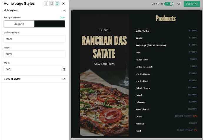
Unlock the potential to tailor your website’s column, row, and main page styles for different screen sizes. Take a look at the screenshot, and you’ll see three distinct buttons, each designed for a specific device size:
![]() Mobile - Perfect for handheld devices.
Mobile - Perfect for handheld devices.
![]() Tablet - Ideal for in-between screen sizes.
Tablet - Ideal for in-between screen sizes.
![]() Web - Tailored for desktops and larger screens.
Web - Tailored for desktops and larger screens.
Design Flexibility at Your Fingertips ![]()
Now, you can easily adapt your column and row layouts to precisely match various screen dimensions. Imagine configuring three columns for web, two for tablets, and one for mobile, all with a simple click. Any changes you make will be automatically applied to the selected size category.
But that’s not all! While we’ve introduced this feature for the main page and columns and rows, this is just the beginning. Stay tuned for even more exciting enhancements for other blocks in the future.
![]() Make Your Website Shine Everywhere
Make Your Website Shine Everywhere ![]()
We’re dedicated to assisting you every step of the way. If you encounter any issues or have questions, please don’t hesitate to reach out. Your satisfaction is our top priority.
So go ahead, explore this remarkable new feature, and let your website shine brilliantly across all screen sizes. ![]()
