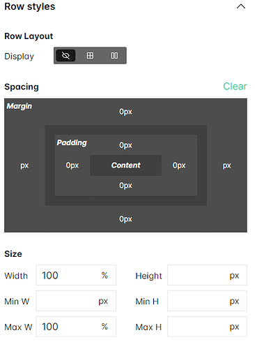
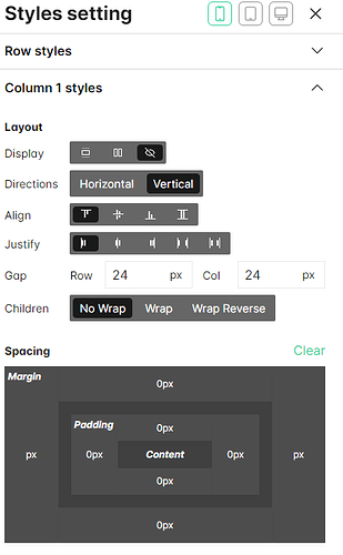
I’m trying to hide an element on mobile only, by using the “Display: None” layout option. in the desktop WSIWYG mobile layout viewer, the element does not render (as desired), however on my mobile browser, the element renders after a few seconds. Screenshots are attached. Interestingly, this USED to work fine, before I changed this element to a new image.
Hey there,
It seems like the responsiveness is breaking because of the large logo on mobile devices. Have you tried using a smaller logo or resizing it specifically for mobile screens? We noticed that the header isn’t displaying properly on smaller devices.
Give it a shot, and if it doesn’t fix things, let us know. We’re here to help sort out the issue further if needed!
Thanks for the clarification. Can you advise the best way to resize it to display clearly on mobile?
Actually, the image only seems to render after I scroll to the bottom of the page. At the same time, the header logo also resizes to be unreadably small.
Ok, ive managed to sort it out. Thank you for your advice!
1 Like


