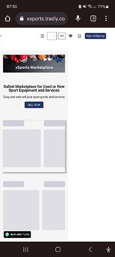
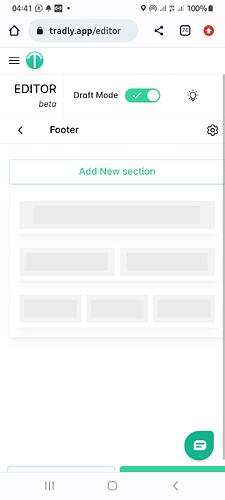
After thoroughly investigating the website’s responsiveness, we’ve identified two issues that need to be addressed:
- Footer Column Alignment:
- Navigate to our editor and access the footer section.
- Inside the footer, locate the row containing the links.
- Click on the settings icon for that specific row.
- Within the row’s settings, you will find an option named “Flex Wrap.”
- Click on “Flex Wrap” and choose the “Wrap” option.
- Save the changes and publish the updated settings.
- Header Column Spacing:
- In the header section, there are two columns.
- The first column has a row gap of 200px which needs to be reduced.
Suggestion for Improvement:
- Consider using three columns in a single row section for the header.
- This arrangement will facilitate achieving the desired UI.
- In the second column, you can incorporate the search block.
- Additionally, consider hiding the second column on mobile devices for optimal display.
can check this video for details:
Amazing, thanks a lot
Our editor’s optimal performance is on large-screen devices. This allows users to preview changes effectively.
But we’ve made some adjustments to improve the experience on mobile screens as well. Now, when you scroll down, you’ll be able to access the publish buttons. Additionally, if you encounter any issues with visibility on the horizontal axis, you can now scroll sideways to view those elements.

